


In the first few seconds of landing on your website, users decide whether they’ll stay or go. If it’s not easy to navigate, they’ll bounce fast. You may have the traffic from SEO and Google Ads, but without a user-friendly design, you’re wasting your efforts. So, how do you create a user-friendly website that keeps visitors engaged and ready to convert? Let’s explore 10 tips on how to create a user-friendly website that’s simple, clear, and built to boost your conversions.
Speed Up Your Site
Why It’s Important: Did you know that just a 1-second delay can reduce conversions by 7%? That’s huge! Page speed is crucial to keeping users happy and engaged, and it’s a key aspect of website usability. If your website takes too long to load, visitors may leave before they even get a chance to interact with your content.
How to Do It:
- Compress images so they load faster without losing quality.
- Minimize unnecessary code and reduce redirects.
- Use a Content Delivery Network (CDN) to speed up loading times.
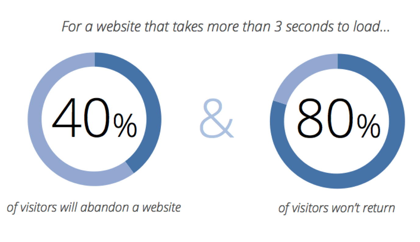
Image By CXL
Insights from Reddit
In a Reddit discussion on what makes a website truly user‑friendly, experts agree that simplicity and clarity are key. A user‑friendly website should have easy navigation, fast load times, and clear, readable typography. Users should be able to find what they need without unnecessary steps or confusion.
What actually makes a website user-friendly in practice?
byu/Ratio-Financial inwebdesign
Make Sure Your Website Works on Mobile
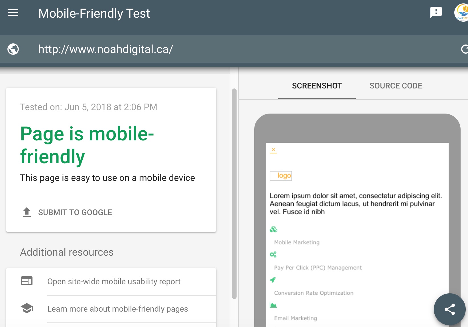
Why It’s Important: More than half of all web traffic comes from mobile devices. If your site isn’t mobile-friendly, you’re losing potential customers. A user-friendly website design is essential for ensuring that visitors have a seamless experience, no matter what device they’re using.
How to Do It:
- Use a responsive design that adjusts the layout based on screen size.
- Test your site on multiple mobile devices to ensure it looks great everywhere.
- Focus on simplicity and readability for smaller screens.
Pro Tip: Google considers mobile-friendliness a ranking factor, so a mobile-friendly site can boost your SEO too.
Make CTAs Stand Out
Why It’s Important: Calls to action (CTAs) are how you guide users toward taking action, whether it’s signing up, booking an appointment, or buying a product.
How to Do It:
- Use action-oriented language like “Get Started,” “Learn More,” or “Book Now.”
- Make your CTAs stand out with bold colours and strategic placement.
- Keep them visible throughout the user’s journey, don’t hide them!
Data Insight: Studies show that personalized CTAs can increase conversion rates by over 200%. Make sure those buttons speak to your users’ needs.
And if you want to have a straightforward website, Noah Digital’s website design service can help you create a clear and user-friendly website where your call-to-action button is prominently displayed.

Ensure a logical flow & be straight to the point
Again, the user should always know what to do next. If they feel like they need to see your social media, ensure that you have all your social media linked on your website. If they want to see “About us” information then ensure you have that clearly stated in your website. The flow matters and it should always be logical. If your website is all disorganized and the user finds themselves confused during their interaction, then this website is not user-friendly. The user behaviour on Google Analytics is a metric that allows you to see where most people exit out, or where they spend most of their time. This information can help you pinpoint loopholes that you may need to fix to ensure a straight forward user experience.
Be clear with your headlines
Great! Now that you’re through the very first impressions you are onto the next one which is the headlines. If a user lands on your website and they still have no idea who you are or what you do, then this is a huge issue. I see so many websites that have no clearly defined keywords on their homepage just because they assume that people already know who they are. Do not assume. If you are a clothing store, make sure you have that keyword set somewhere clearly on your homepage so you are not leaving any users confused.
![]()
Fix any broken links
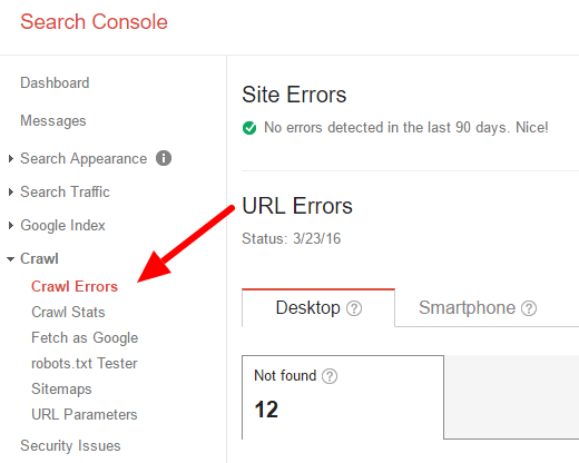
A broken link on your website is a very bad look. For a user-friendly website, it’s essential that every link works properly to maintain a smooth, seamless experience for visitors. Google Search Console allows you to see the performance and overall functionality of your URLs and you can see if you have any errors or broken links on your website. Fix these as soon as possible! Not only do they affect your SEO in search engines, but it also affects the way users perceive you if they click on a broken link. If a user ever lands on a broken link, most of them will absolutely just exit out, instead of having to go backwards and back into your website.
Use Readable Fonts
Why It’s Important: No one wants to squint to read your website. Poor typography can drive visitors away before they even get to your content. Good typography plays a huge role in improving website user experience, ensuring that users can easily read and engage with your content without frustration.
How to Do It:
- Choose easy-to-read fonts with good contrast against the background.
- Stick to font sizes of at least 16px for body text.
- Limit the use of fancy fonts to headers, keeping the rest simple.
Make Your Content Short and Sweet
Why It’s Important: People scan websites, they don’t read word for word. You want them to get the point fast.
How to Do It:
- Break content into smaller, digestible chunks.
- Use headings, subheadings, and bullet points to make scanning easier.
- Avoid long paragraphs and keep your language simple and clear.
Use High-Quality Images
Why It’s Important: Low-quality images can make your site look unprofessional. Great visuals engage users and make your content more compelling.
How to Do It:
- Use high-resolution images that enhance the message of your content.
- Optimize images to improve load times.
- Avoid generic stock photos that don’t match your brand or message.
Keep Navigation Simple and Clear
Why It’s Important: We’ve all been there, clicking around a website, getting lost, and finally just leaving. Simple, intuitive navigation is key to making visitors feel at home.
How to Do It:
- Limit the number of menu items to avoid overwhelming visitors.
- Use clear labels like “Services,” “Contact,” and “About” that people instantly understand.
- Group similar pages together and make sure your navigation is easy to spot.
Final Thoughts
By following these 10 tips, you can create a website that’s not just visually appealing but also functional, intuitive, and designed to keep visitors engaged. A user-friendly website is the foundation of a successful online presence. Start with these simple changes and watch your user experience and conversions improve!
If you would like a third person to quickly audit your website, Noah Digital would be happy to, just shoot us a message. We focus on marketing-ready websites that turn traffic into conversions.